Installation in Progress ...
(07/17/2013 | Seattle, WA | Photo Credit: Cat Silva)
The next morning, I took a pause on my way to the bus stop and investigated the new part of my neighborhood. My first impression is: "woo-hoo! A green bike lane is down the street!!" After taking a close look, I'm still excited and am happy to see the bicycle infrastructure--but there are a few things I find a little odd about what has been installed.
Before I comment on the new facility, let me mention that I have nothing to do with this project--past being an exciting future rider--and this is merely my opinion. I haven't looked a the final design scheme for the intersection and look forward to seeing how this new piece of bicycle infrastructure fits into the developing transportation network.
One Green Lane, but Two Different Pavement Markings?
(07/18/2013 | Seattle, WA | Photo Credit: Cat Silva)
Ok - let's review. The Manual on Uniform Traffic Control Devices provides standard uses of a shared lane marking--the "sharrow". Of the five main bullet points for when/why to use these pavement markings, three state that the marking can signal the intended lateral position --guiding riders where on the road to travel, creating a predictable path that makes the shared roadway safer.
This "sharrow" they have installed appears to say to cyclists: "as you go up this hill, you're going to be sharing the roadway." ...However, after a busstop ahead, a climbing lane is provided... OR, maybe it is for drivers heading north (left) who may not notice the bright green paint or do not know that the green paint means: "hey - there could be a bicycle here!"?
(07/18/2013 | Seattle, WA | Photo Credit: Cat Silva)
In my own internship I have pushed-back on following the MUTCD line for line, so I do respect that the designers did what they thought was right at that particular location. It is a difficult spot. You've got streetcars turning, drivers from all sides and accommodating bicyclists safely over the tracks and across the intersection is tricky. That said, I just wonder about the exact implementation of the facility.
The "sharrow" seems like the wrong pavement marking for this location--but maybe I'm just knit-picking a nice new facility fresh with bright green paint.
Beautiful Texture, Straight Lines, Vibrant Color!
(07/18/2013 | Seattle, WA | Photo Credit: Cat Silva)
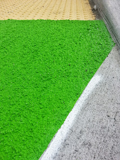
And the paint really is neat. Not only is the green color vibrant, the construction crew applied a very cool textured treatment beneath the green paint. I have seen bicycle lanes with dull green colors that are easily overlooked by drivers--so I was thrilled to see such a commitment to the facility with the loud color. I note this in comparison with the green bicycle box that was installed on Pike Street at 12th Avenue in Capitol Hill a couple of years ago. This is a facility that I was very happy to see, and still am glad for it's presence when I need to take left turns on to 12th. But after time, the paint is wearing away and the color is a darker green than what the City just used.
(08/09/2013 | Seattle, WA | Photo Credit: Cat Silva)
I am also compelled to note how well installed the new facility is. The lines are straight. The texture even. And, there are no traces of green paint on the surrounding pavement. Those men who installed the new facility clearly put energy into precise implementation. This is very important, in my opinion, because now when my neighbors see this they will see a nice, crisp bicycle lane that is adding value to the street--instead of sloppy lines for a facility they "won't even use". So thank you to those who were part of that work crew!
ADA Treated Bicycle Facility
(07/18/2013 | Seattle, WA | Photo Credit: Cat Silva)
Looking Forward...
But with all that said, am ultimately happy as heck to see this type of facility implemented in my neighborhood--be it exactly as I would have designed it or not. It's good to see an investment in bicycle riders and this type of facility adds safety to those crossing a soon complicated intersection. When I return from Aalborg, much will have changed at that corner and I will await any final opinion or thoughts until I see how it all fits together.


No comments:
Post a Comment